
4 Ways You’re Annoying Your Customers
Have you ever heard a really annoying noise before?

Whether it’s a repetitive squealing sound coming from your fridge, or a mosquito buzzing in your ear — what’s the first thing you try to do?
You try to turn it off as fast as you can, right?

Well you’re not the only one who’s doing this…
Your customers are also “turning off” the annoying sounds of marketing every day!
Today you’re going to learn about 4 mistakes you’re making that annoy your customers because these mistakes create friction for them.
If you make 1 wrong move, your potential customer can end your virtual life (to them, anyway) FOREVER in an instant by X-ing out of your website! Never to return!
You can’t afford ANY friction or confusion in your messaging.
What kinds of missteps could you even be making? Let’s learn the 4 most common causes of friction that are annoying your customers.
Friction Annoys Your Customers
“Friction” is an abstract concept so it might be hard for you to imagine exactly what it is.
Friction is commonly confused with anxiety. It’s not anxiety though, friction is a unique experience from anxiety.
Anxiety comes from a place of psychological concern.
People might feel worried about paying for your product if you don’t have that little lock symbol in your URL bar showing your website has a secure connection.
The might also be concerned if you make larger-than-life claims about your product, especially if you’re making grandiose claims without providing any evidence.
Friction is psychological resistance in the mind of your reader.
Now, let’s learn about some of the not so obvious ways you could be creating friction and turning off your customers.
#1 Your website’s layout
Take a look at this (old) design for the Census Bureau’s homepage:
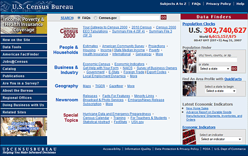
Researchers from the Nielsen Norman Group asked participants in an eyetracking study to use the website to locate the USA’s current population.
Of the people asked to find the current population, 86% of them failed to find it.
Ouch!
Why does the Census Bureau’s website create friction?
The answer to why 8 in 10 people missed out on the homepage’s #1 goal is all in the eye-path.
And you’ll see this mistake repeated in some of our real world business examples too.
Look at it again:
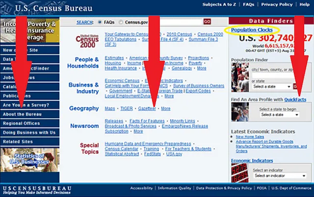
You’ll notice that the homepage is organized in 3, nearly equally sized columns.
You DON’T want this!
The reason why equally sized columns create friction is because it’s against how people naturally process your webpage.
This makes reading your website confusing.
To “tune out the noise” they turn “you” off.
What we know about when people read articles on a computer is that most people approach it with a certain pattern.
First, they’ll scan the top section. They’re looking for context: Where am I?
Next they begin to scan down the left side.
Fun fact, we actually know that this is also true of languages that are read right-to-left as it is about left-to-right languages like English.
So at this point the basic scanning pattern is an upside down L shape.
When they find your content interesting, people will finish the article by scanning down the left side and moving to the right (although often not as far over through the sentence as at the top of the page).
DEPENDING ON HOW INTERESTING YOUR CONTENT IS, ultimately people read your webpage in an F pattern, an E shape, or that upside down L shape we mentioned before.
Keep in mind, that’s in a PERFECT WORLD.
That’s why things like visual design principles (or at least basic messaging hierarchy) are SO important — because following people’s natural, preferred way to read increases conversions.
When you have a bad design, your reader’s eye-path doesn’t look like this.
So here’s how all of this “eye-path” stuff looked on the Census Bureau’s website:
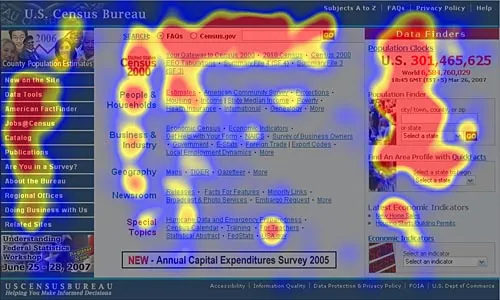
So why did 86% of people fail to find the current population?
Look at the blue of the heatmap above, hardly anyone looked at the last ⅔ of the number!
Actually, almost 70% of viewers did “see” the information but most people did not read the whole population clock so they missed the main message.
“But, what do the columns have to do with it?”
The heatmap above is an average of all of the participants tracks. It can be a little confusing to make sense of what’s going on that way.
This plot shows the 4 most common “styles” of gaze patterns:
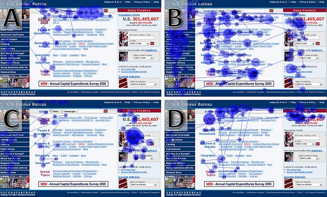
Plot A style gazes made up about 57% of the participant’s gaze styles.
Wow, so shockingly right out of the gate more than half of viewers didn’t see the population clock at all!
These undesirable results make a lot of sense based off of the eye-path encouraged by the website’s layout.
One big weakness of this page is that the population clock is almost buried by this onslaught of other, non-essential information (especially when the goal is for viewers to be able to find the current population).
Remember, your left half of the screen gets about 69% of the view time! (The right gets the other ~30% of the view time.)
Plot B participants tried to rely more on the navigation menu along the top and left edges of the screen, scanning the sidebar hyperlinked text and hoping for the best choice to click through to.
It’s interesting to notice that on ALL of the plots almost all users focus on a red text logo that says “Census 2000” in the top left corner of the main content area. (It’s easiest to see in plots A and C.)
Clicking the “Census 2000” logo took you to the census from 2000.
So, no-go there.
Unless forced to do it in a study, none of your customers are going to be merciful enough with you to give you 1 wrong click!
Do you see how in almost all contexts, people use the top and left edges FIRST when trying to create context? Only afterwards do they default to the right edge, and then the middle — but they honestly would have X’ed out your website wellll before that point.
Plot D shows the pitiful 14% users who actually FOUND what they were looking for! That’s through zero fault on their part; this layout is working against them and creating friction.
Here’s the real reason why columns give people this much of a problem:
People have trouble “hearing” multiple messages.
All of the information in the sidebar to the left was not aligned with their #1 goal, none of the content at the top edge was aligned with their #1 goal, and when users scanned down the left side none of that content was aligned with the Census Bureau’s #1 goal (can people find the current population).
Having all of that extra, irrelevant information in the way was like a sea of voices drowning out their main message.
Now, look at the current design of the Census site and tell me: What’s the world population?
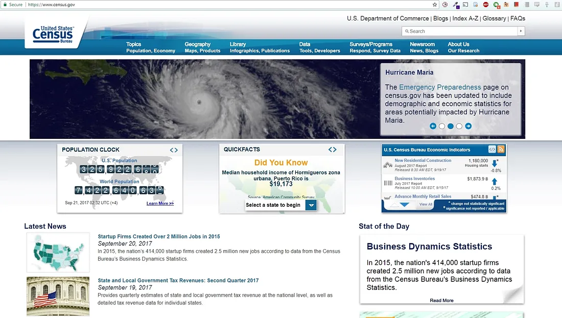
I recommend checking out www.Census.gov too so you can get the full picture
I’m sure the lower left placement and motion of the animation really drew your eye.
How else does the eye-path, or sequence, of your content cause friction and piss off your customers?
#2 Confusing Content Organization
The reason that eye-path is so important is because it allows you to control what people think of 1st, 2nd, and 3rd.
When you’re trying to convince prospects to become customers, you’re trying to have a rational conversation where you persuade them that working with you is in their best interest.
As a business owner, every single product or service you have is to make your customer’s life better — right?
You’re the vehicle for helping them get what they want! That’s the whole point of business. 🙂
When you want to persuade someone, you have to keep in mind that you’re trying to convince them — not yourself.
What I mean by that is you have to step outside of your own shoes and see the issue from the other person’s point of view.
There’s a natural customer logic that a prospect uses to decide if they want to work with you or not.
Understand it, and use it to your advantage!
Let’s think about the classic PAS copywriting formula again:
Problem-Agitate-Solution
Look at that under-performing page on your website (particularly one where the objective is to start the sales process like by generating leads or making sales).
What does it say?
Maybe it starts with something like “We’re a family owned and operated company for 20 years,” or you start launching into describing your product.
Maybe you just have an order form over there!
When you’re starting with your business or your product, you’re starting with the solution.
See the problem here?
You’re skipping a lot of other steps that your prospects take to make a decision!
Don’t work against your prospects, work with them so you can ensure that the path toward working together is as smooth as possible.
Let’s take a closer look at what exactly “solution leading” and “problem leading” look like:
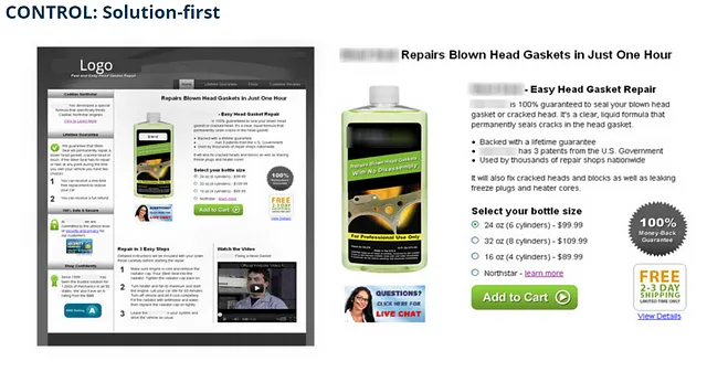
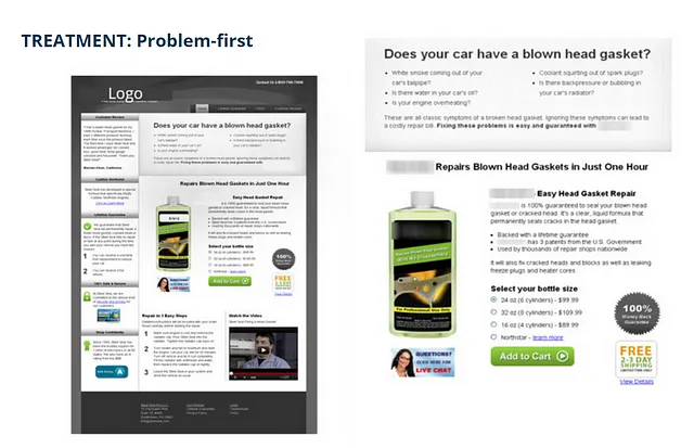
The organization of your on-page content should be directed at:
- Helping them understand the problem
- Validating that they have the problem you post solve and
- Verifying that they want to make changes in their life to reach their personal goal!
Here’s further reading on how to organize content in alignment with how your customer’s logic:
This might seem like common sense, but you’d be surprised how many business owners are making this mistake:
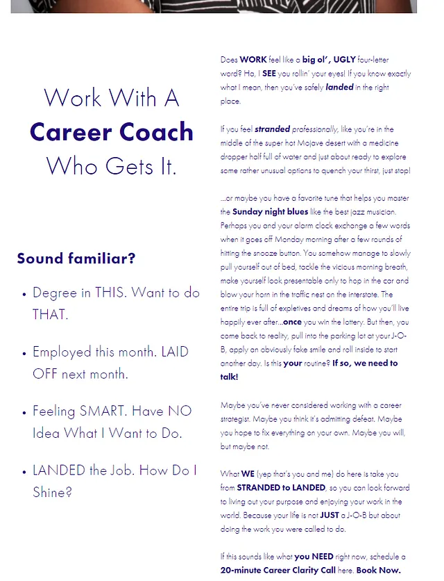
On this webpage the #1 goal is to generate leads by getting prospects to book a discovery call.
Not photographed: A call to action to book a discovery call that’s along the top edge. That was a good call!
There’s a lot of great copy here to support that goal, and that demonstrates the value this coach can bring to you — but it’s a confusing layout!
The earlier image is very zoomed out so you could get a feel for the whole layout of the page, this is more what it looks like to prospects…

The 2 columns of text makes the content feel disorganized, it lowers the chances of people finding the information they want, and honestly it just feels like 2 people talking at once!
Especially since what’s on the left is actually related to what’s on the right.
The copy on this page very closely follows PAS, if only it could somehow be organized differently…
A vertical orientation would make more sense than this horizontal arrangement!
Here’s how this page would look in my perfect world:

Isn’t it amazing how huge of a difference one simple change makes?
Here are 2 other examples of confusing content organization:
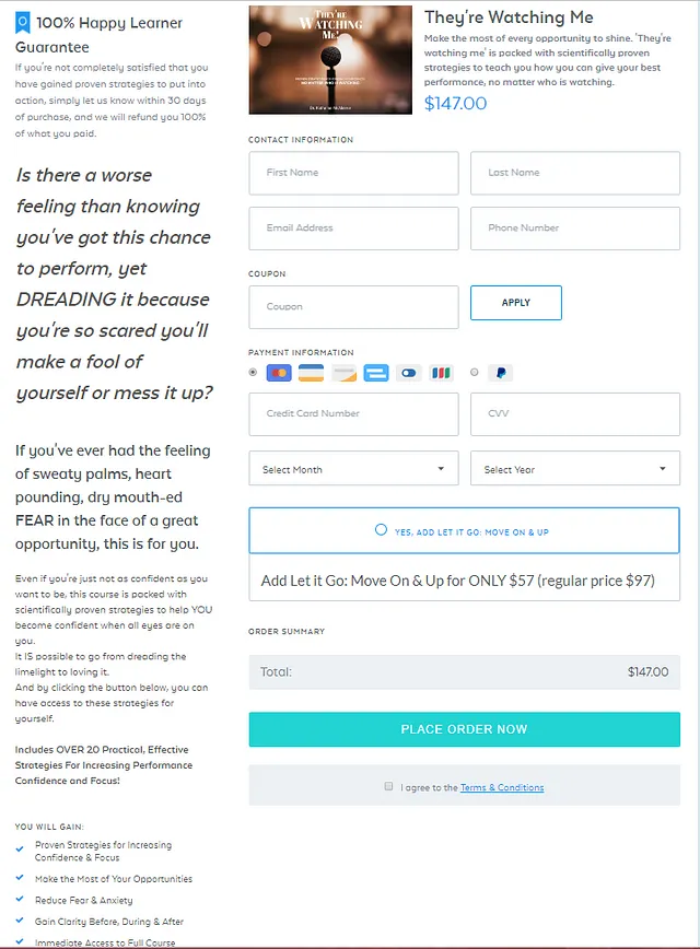
This layout focuses too much on the solution. What’s the first thing you see in the top left? A satisfaction guarantee!
And there’s an order form before the copy explaining what we’re even looking at.
Do you see how that’s a total turnoff for your customers?
How would you change this around for better conversions? (Hint: Again, there’s surprisingly good copy about the problem — if only it were in a better placement…)
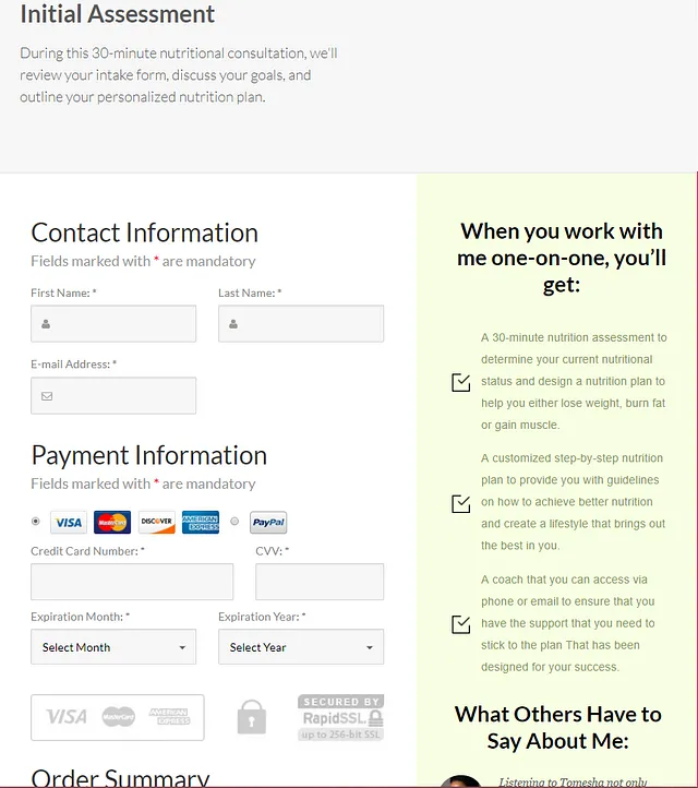
And again, this one has the same problem. Except this page is even worse off, because the copy is along the far right hand side — so people don’t naturally look over there.
When you’re so “in the thick of things” as the business owner, this type of error might not register with us.
Of course they know what I mean, I know what I mean!
You shouldn’t leave anything up to chance by assuming that your prospects are operating on the same level of understanding as you.
Lead from the problem, and only after qualifying that the prospect is interested should you move on to talking about yourself (you’re the solution).
#3 Too Many Objectives
It was the best of times, it was the worst of times… A Tale of 2 Homepages.
Take a look at this homepage:
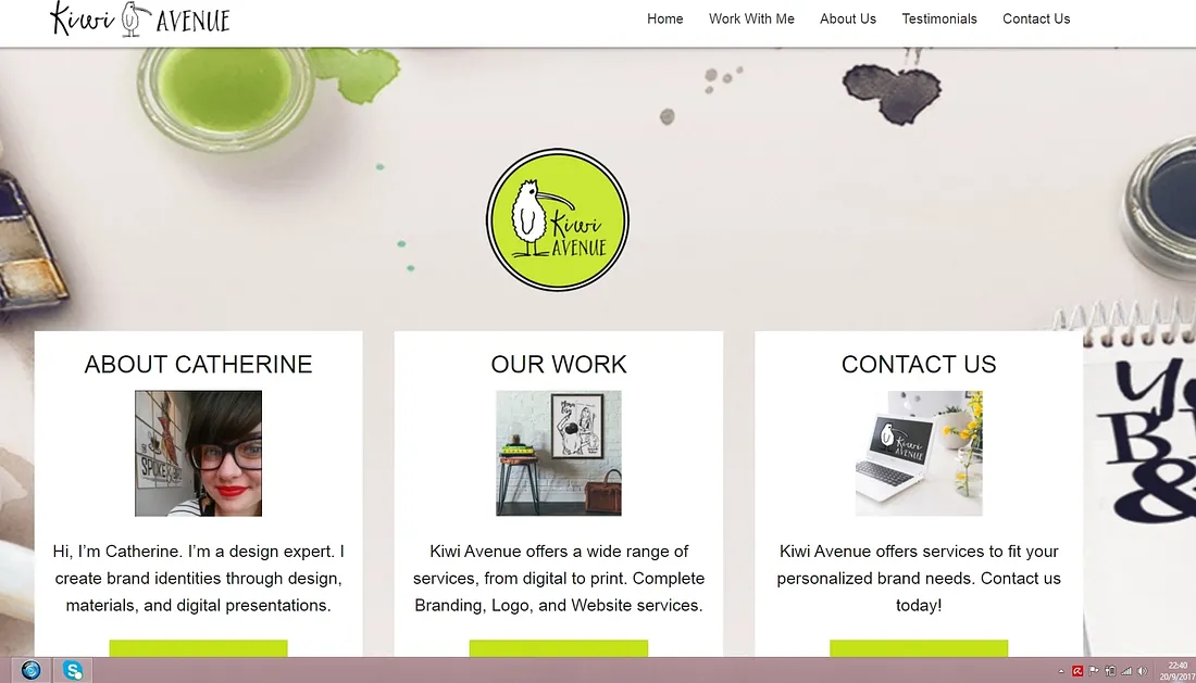
From what you’ve already learned, what might be wrong with this page?
Right off the bat I notice that all of the calls to action are below the fold, meaning they’re not visible to me immediately when the page loads. I have to scroll down to see them…
People spend 80% of their time “above the fold”, never scrolling down.
So I see it as a huge problem that the CTA’s aren’t immediately available.
But there’s an even bigger problem with this homepage…
Answer this for me:
What does she want you to do on this page?
Uh-oh…
We’re back to our old friend horizontal orientation.
Another problem with lining things up side by side online — besides the fact that it causes reader’s eyes to whirl around the page looking for something to focus on — is that it makes the options seem equivalent.
Should you read her about page?
Because right now the way her page is set up, I’d say that’s the most likely thing people would do because of its placement on the left.
Does prioritizing having viewers read the about page move you closer to your sales goals?
Should you look at her work? Contact her?
When you don’t pick 1 goal to prioritize on your page, you’re leaving it up to your customer to choose a goal.
Nobody wants to spend their time deciding what you want them to do!
It might seem like you’re doing your prospects a disservice by prioritizing 1 thing above others.
You have so many great pages on your website!
If everything is equally prominent, then nothing is prominent.
So by advising the user on what their next best step is, you’re actually doing them a favor by guiding them to the most important choices!
If people are coming to your website to hire you, do that. Only afterwards should you focus on getting them to wherever else they want to go.
The idea of prioritizing a main goal over everything else is called a messaging hierarchy.
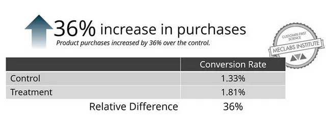
Here’s a great example that shows the increase in conversions from a clear messaging hierarchy, as well as demonstrating what the difference is between many messages and a hierarchy:
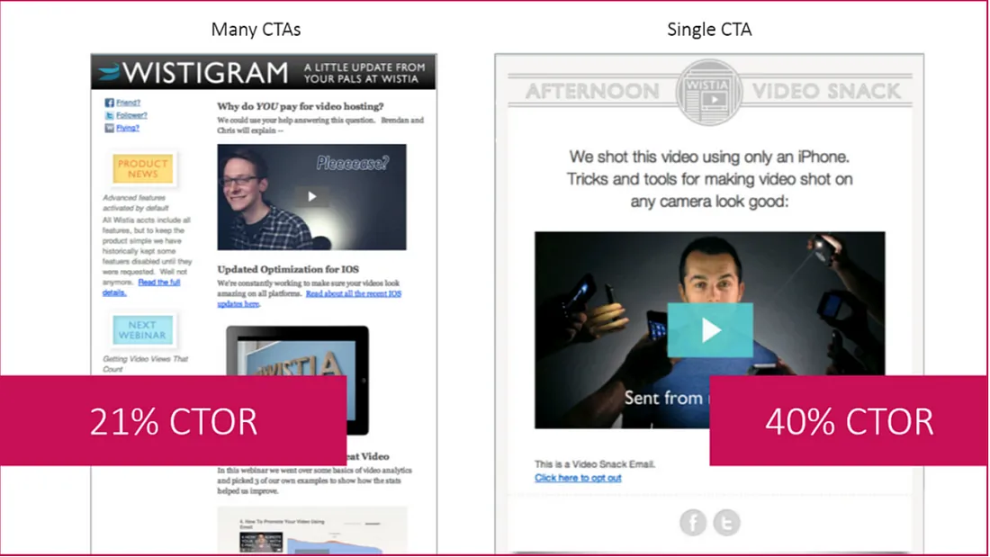
So how could we fix Catherine’s website? Imagine what it could look like if she focused on streamlining getting people to work with her by prioritizing lead generation as her goal…
Here’s a second example to show this:
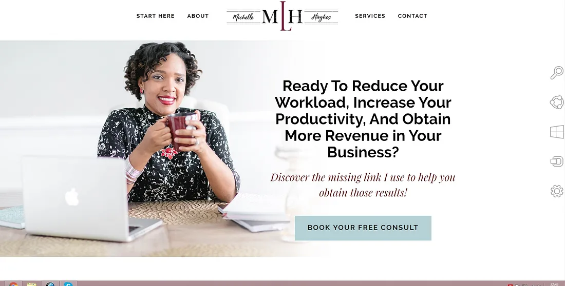
Notice that Michelle also has a goal of generating leads from her website!
There are other places that prospects are free to view (they can scroll down, go to her blog, find more detailed breakdowns of her services), but right there at the top Michelle guides them to their best choice: booking a discovery call.
A lack of a clear messaging hierarchy, or an absence of a clear “next step” annoys your customers.
#4 An Annoying Tone
What’s tone? The tone of your copy shows readers how you feel about the topic based only off of your choice of words.
If you Google “tone in writing,” you’ll find lists of hundreds of words used to describe literature like “vexing,” “cynical,” and even “guilty.”
Unfortunately, not many of these literature terms apply to writing for the web.
The Nielsen Norman Group has analyzed thousands of individual webpages and created a simple to use framework for tone on the web:
Your writing can be…
- Funny or more serious
- Formal or more casual
- Enthusiastic or more matter-of-fact
- Respectful or more irreverent
The biggest problem with tone on the internet today is too much “business logic.”
Look, I know that you want to always give off a professional image — but you don’t have to write every single webpage like it’s a memo going to the President!
Studies show that the most effective copy on the web is casual, CONVERSATIONAL, and enthusiastic.
The best advice I have to give you for improving your tone is don’t try to “write like” anything.
Don’t write it like your boss is going to see it, don’t write it like you’re pretending you’re in front of a customer.
How can you nail that perfect “just be yourself” tone?
I recommend you sit down with a friend (preferably a friend who doesn’t know much about your industry) and you record yourself explaining topics to this person!
The absolute best way you can sound 100% like yourself, is to copy yourself!
The real key is conversational (enthusiastic) tone, being funny can be a strong differentiator from your competition but sometimes it can alienate people from your brand if they’re not resonating with your humor.
What’s the difference between a conversational tone and a matter-of-fact tone?
Take a look at these 2 examples of tone:
The Nielsen Norman Group created 2 fake websites for imaginary banks to test how tone impacted viewer’s perception of trustworthiness, friendliness, and desirability.
Example 1: Gamma Bank
“Open an account today to get multiple interest-bearing accounts and complimentary and discounted services.”
Do you see how this copy is very factually based? Not a lot of bells and whistles, and some of the jargon could be unapproachable to consumers.
Example 2: Delta Bank
“Everything you need and want from a bank: online and mobile banking services, a debit MasterCard, and standard checks. And those are just a few of the features included at no charge.”
This copy is describing essentially the same services as the Gamma bank example, but the conversational tone makes the copy way more approachable.
It’s interesting to note that viewers rated Delta Bank as MORE friendly, trustworthy, and desirable than Gamma.
So don’t be afraid to step away from your “business logic” because it’s getting in the way of you communicating with your customers.
